The COVID-19 pandemic brought much economic activity to a sudden halt. The unemployment rate in the US rose by more than ten percentage points in April 2020, by far the sharpest monthly move ever recorded. Even so, many observers questioned whether the true spike in unemployment might have been much larger than the official numbers acknowledged.
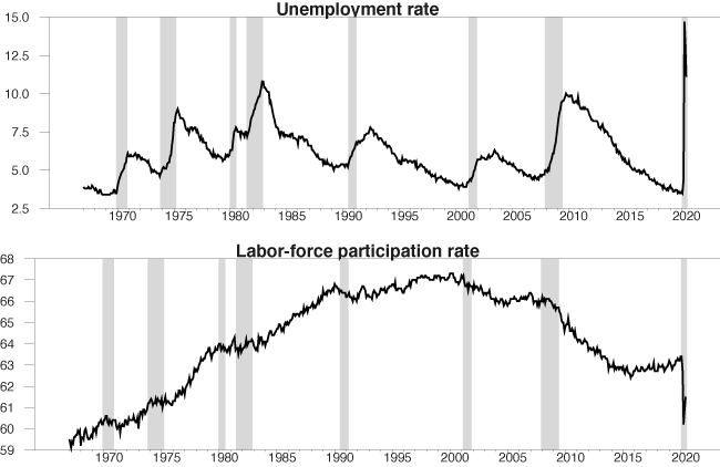
At the same time that the reported unemployment rate was spiking up, the reported labour-force participation rate came crashing down (see Figure 1). There were 8.3 million Americans who stopped working between February and April 2020 and who were not counted by the Bureau of Labor Statistics (BLS) as unemployed, but were instead designated as having dropped out of the labour force.
Figure 1 US unemployment rate and labour force participation rate
Notes: Top panel: US unemployment rate as a percent of the labour force as reported by BLS. Bottom panel: labour force as a percent of the noninstitutional adult population as reported by BLS. Both series seasonally adjusted, monthly from January 1967 to June 2020. Shaded regions indicate NBER recession dates.
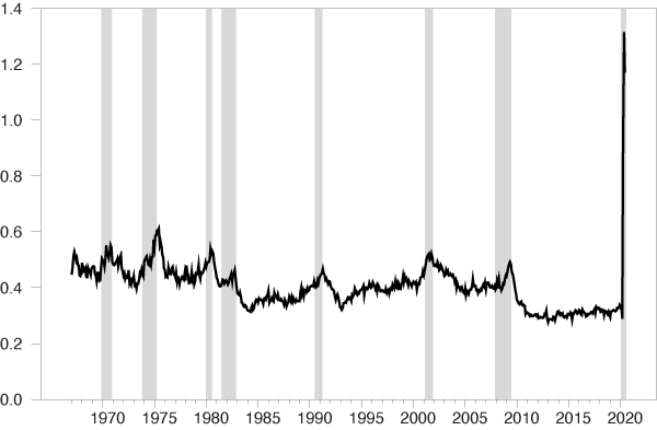
The BLS measures are based on the Current Population Survey, often called the household survey. One reason to be sceptical of the recent numbers is that they are inconsistent with separate measures we have of the number of Americans who were collecting unemployment insurance. Not everyone who is unemployed qualifies to receive insurance, and not everyone who is qualified applies for it. Usually the number of people collecting insurance is about one-third to one-half as large as the number counted as unemployed by the BLS. But in May 2020 there were 30% more people collecting insurance than the total number counted as unemployed by the BLS (see Figure 2). Though it is possible that false or duplicate claims might have overstated the size of initial claims in recent months, the inconsistency is far too large to be explained by this alone.
Figure 2 Ratio of insurance claims to BLS count of unemployed
Notes: Ratio of sum of number of people making new and continuing claims for unemployment insurance (four-week seasonally adjusted averages as of the second week of the month, from https://fred.stlouisfed.org/series/ICSA and https://fred.stlouisfed.org/series/CCSA) to BLS count of number of people unemployed (seasonally adjusted, from https://fred.stlouisfed.org/series/UNEMPLOY).
Part of the problem was acknowledged in the April Employment Situation Summary released by the BLS.1 This indicated that significant numbers of individuals who were counted as employed but absent from work should, according to the BLS’s intended procedures, have been counted instead as unemployed on temporary layoff. The BLS indicated that if these workers had been correctly classified, the unemployment rate would have been five percentage points higher in April and one percentage point higher in June. But this is not enough to account for the discrepancy with the unemployment insurance pay-outs and offers no explanation for the sharp drop in labour-force participation.
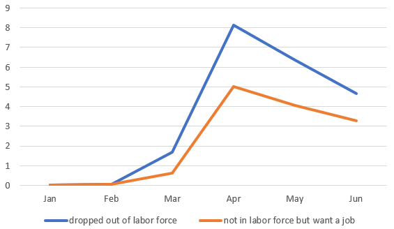
Interestingly, 70% of the people who were counted in June as having dropped out of the labour force indicated in answering another question in the survey that they wanted a job at that time. Usually this group only accounts for 5% of those not in the labour force. A value of 70% calls into question the accuracy of classifying these individuals as having dropped out of the labour force during the COVID-19 pandemic.
Figure 3 Change in labour force and number not in labour force who want a job
Notes: Blue: number of people who dropped out of the labour force relative to January 2020, in millions. Orange: change since January in number of people not in the labour force but say they want a job. Data source: https://fred.stlouisfed.org/series/CLF16OV and https://fred.stlouisfed.org/series/NILFWJN
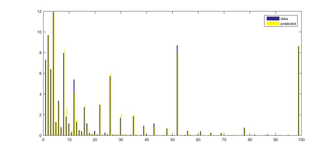
Although there were significant challenges in collecting statistics during the pandemic, an important part of the problem is related to concerns about the household survey itself which have long been raised. Rothstein (2011), Elsby et al. (2011), Elsby et al. (2015), and Farber and Valletta (2015) argued that many of the individuals who are typically counted as not in the labour force should really be regarded as unemployed. One feature of the data that we highlight in a recent paper (Ahn and Hamilton 2020) is that in a typical month, 1.6% of the people who are counted as not in the labour force will be counted as unemployed the following month and will moreover indicate in the following month that they have been looking for work for longer than four weeks (see Figure 4).
Figure 4 Reported unemployment duration of people who were not in the labour force during previous month
Notes: Horizontal axis: reported duration of unemployment in weeks. Height of blue bars: of the individuals who were not in the labour force in month t and unemployed in month t + 1, the percent who reported having been searching for work as of month t + 1 for the indicated number of weeks. Yellow bars: value predicted by the econometric model in Ahn and Hamilton (2020).
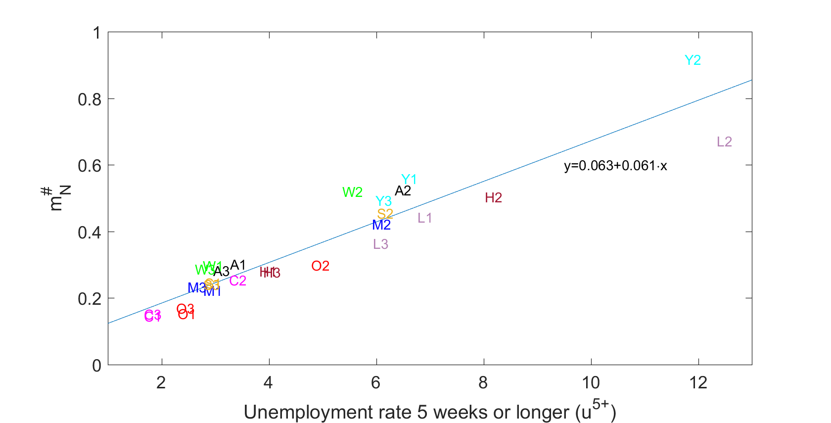
We observe this phenomenon in every demographic group and at every point in time. The horizontal axis in Figure 5 below plots, for a particular subsample, the percentage of people who were counted in month t as having been unemployed for longer than four weeks. The vertical axis plots a measure of the number of people in that subsample who were counted as not in the labour force in month t but were counted as unemployed for longer than four weeks in month t + 1. There is a remarkable correspondence between these two numbers. One can predict pretty accurately, for any demographic group or any point in time, how many of the people, who this month are being counted as not in the labour force, will be counted next month as having been unemployed for longer than one month. Whenever the reported unemployment is higher, more of those currently counted as not in the labour force will next month be counted as having been unemployed for longer than one month.
Figure 5: NU5+ observations for different groups and points in time
Notes: Vertical axis: percentage of group classified as N in month t and U in month t + 1 with duration of job search in t +1 reported to be five weeks or longer for different demographic groups and three different sample periods. Horizontal axis: Percentage of the labour force who are counted as unemployed in t with duration of job search of five weeks or longer. Demographic groups: A: Total population, Y: aged 16-24; M: men aged 25-54; W: women aged 25-54; O: aged 55 and over; L: less than high school education, H: high school graduate; S: some college; C: college graduates. Sample 1: 2001:7-2008:6; sample 2: 2008:7-2014:6; sample 3: 2014:7-2020:1. Also shown is a regression line fitted to the 27 observations. Source: Ahn and Hamilton (2020).
We also know that these individuals will have similar prospects of getting a job in t + 2, and similar prospects of remaining unemployed in t + 2, as those who were counted as unemployed in month t, both quite different from the rates typically seen for those counted as not in the labour force in t. Consistent with the observation during the pandemic, many also indicated in month t that they wanted a job. Our 2020 paper highlights a variety of evidence pointing to the conclusion that these individuals should be counted in month t as unemployed rather than not in the labour force.
Another important disruption to the survey is that the response rates between March and June 2020 were substantially lower than the pre-pandemic level. Our paper found that in normal times, people were more likely to be missed by the survey if they were unemployed.
A further problem in the household survey is rotation-group bias, which is the tendency of the unemployment and participation rates to decline the more times individuals are surveyed (see Solon 1986, Halpern-Manners and Warren 2012, and Krueger et al. 2017). In any given month t, some individuals are being asked the survey questions for the first time, others for a second time, and others for an eighth time. The statistics for month t are based on adding together the answers all the people give in month t. But it turns out there are substantial differences on average between the answers people give the first time and the answers they give the eighth time. Over July 2001- February 2020, the average unemployment rate would have been 6.6% and the average participation rate would have been 65.8% based on first-time answers, but only 5.7% and 64.2%, respectively, based on eighth-time answers.
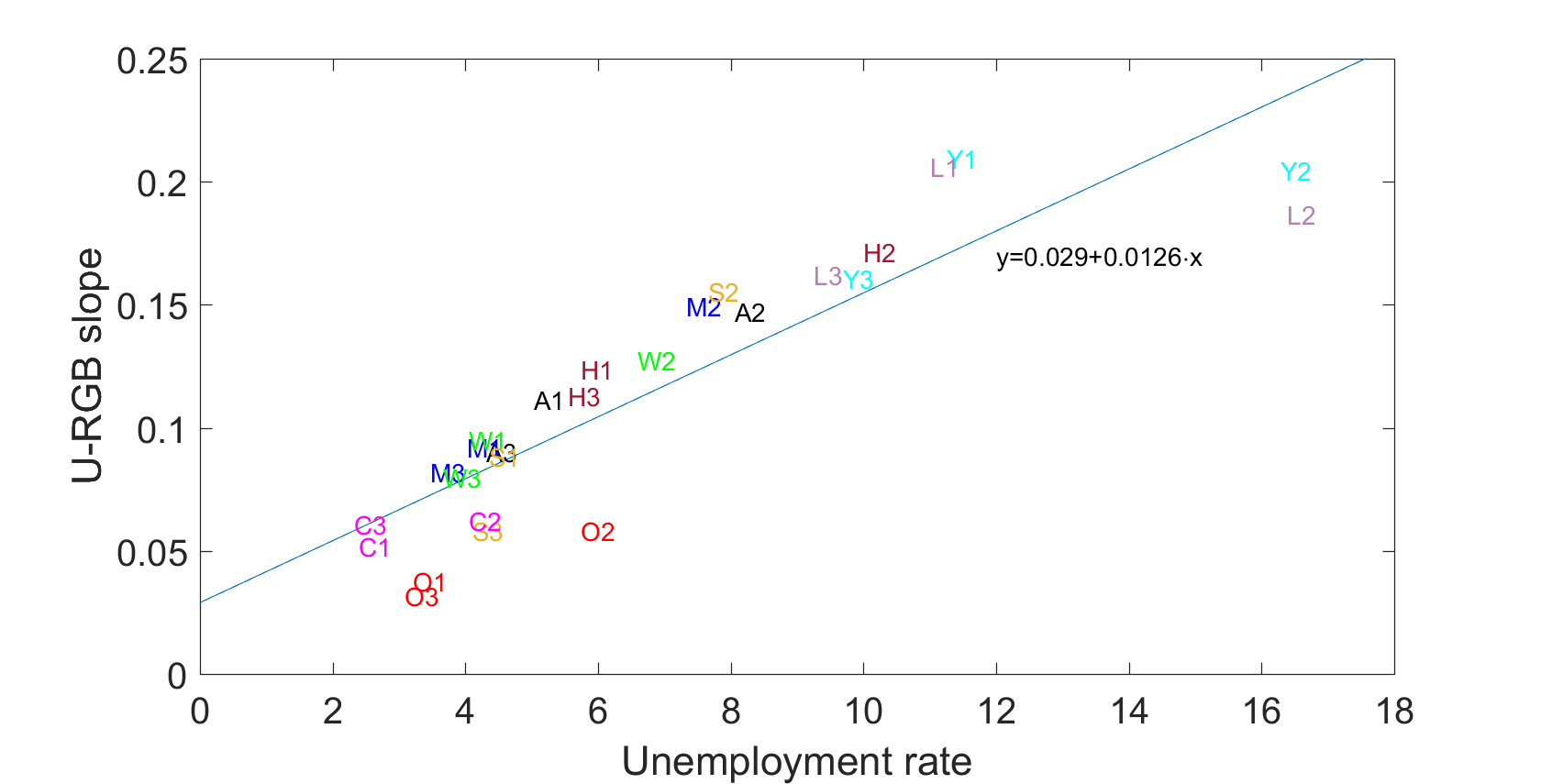
The vertical axis on Figure 6 below plots a measure of rotation-group bias suggested by Krueger et al. (2017) for different demographic groups and different points in time, which is how much on average the unemployment rate drops with each additional interview. The horizontal axis plots the BLS reported unemployment rate for that subsample. It appears to be a universal law that the answers between the first interview and the eighth interview change most dramatically when the unemployment rate for that group at that point in time is higher.
Figure 6 Unemployment rate and rotation-group bias
Notes: Horizonal axis: unemployment rate as reported by BLS. Vertical axis: average decline per interview in the reported unemployment rate. Demographic groups: A: Total population, Y: aged 16-24; M: men aged 25-54; W: women aged 25-54; O: aged 55 and over; L: less than high school education, H: high school graduate; S: some college; C: college graduates. Sample 1: 2001:7-2008:6; sample 2: 2008:7-2014:6; sample 3: 2014:7-2020:1. Also shown is a regression line fitted to the 27 observations. Source: Ahn and Hamilton (2020).
What is going on here? One possibility is that unemployed individuals perceive some stigma associated with their status and become less engaged the more times an interview is attempted. We observe that the number of people counted as unemployed drops more sharply when people answer the questions for themselves than when someone else in the household answers for them. We also observe that more people tend to give answers in subsequent interviews that they think might end the interview more quickly, such as indicating that they are not working because they are retired or disabled. Interestingly, people who report ‘retired or disabled’ in interview 2 are more likely to return to the labour force in interview 3 than people who are ‘retired or disabled’ in interview 1. This again suggests that the BLS systematically underestimates the unemployment and labour-force participation rates at points in time or for demographic groups for whom the true rates are higher.
One of the key findings of Ahn and Hamilton (2020) is that prior to the pandemic, the true unemployment rate for the US is about two percentage points higher on average than the rate reported by the BLS before the pandemic. This conclusion is also consistent with the evidence from the Survey of Consumer Expectations, a new survey independent from the Current Population Survey (Faberman et al. 2019). Moreover, we found that prior to the pandemic the rotation-group bias is largest for demographic groups and points in time for which the reported unemployment rate is higher. The reported unemployment rate this spring was extremely high. We believe that the true value was significantly larger.
Authors’ Note: The views in this column are solely the responsibility of the authors and should not be interpreted as reflecting the views of the Board of Governors of the Federal Reserve System or of any other person associated with the Federal Reserve System.
References
Ahn, H J and J D Hamilton (2020), “Measuring Labor-Force Participation and the Incidence and Duration of Unemployment”, NBER Working Paper 27394.
Elsby, M W L, B Hobijn and A Şahin (2015), "On the Importance of the Participation Margin for Labor Market Fluctuations", Journal of Monetary Economics 72: 64-82.
Elsby, M W L, B Hobijn, A Şahin and R G Valletta (2011), "The Labor Market in the Great Recession-- An Update to September 2011", Brookings Papers on Economic Activity, Fall 2011: 353-371.
Faberman, R J, A I Mueller, A Sahin and G Topa (2019), "Job Search Behavior among the Employed and Non-Employed", Working Paper, University of Texas at Austin.
Farber, H S and R G Valletta (2015), "Do Extended Unemployment Benefits Lengthen Unemployment Spells? Evidence from Recent Cycles in the US Labor Market", Journal of Human Resources 50: 873-909.
Halpern-Manners, A and J R Warren (2012), "Panel Conditioning in Longitudinal Studies: Evidence from Labor Force Items in the Current Population Survey", Demography 49(4): 1499-1519.
Krueger, A B, A Mas and X Niu (2017), "The Evolution of Rotation Group Bias: Will the Real Unemployment Rate Please Stand Up?", Review of Economics and Statistics 99: 258-264.
Rothstein, J (2011), "Unemployment Insurance and Job Search in the Great Recession", Brookings Papers on Economic Activity, Fall 2011: 143-196.
Solon, G (1986), "Effects of Rotation Group Bias on Estimation of Unemployment", Journal of Business and Economic Statistics 4: 105-109.
Endnotes
1https://www.bls.gov/news.release/archives/empsit_05082020.htm

