Since 2012, the Federal Open Market Committee (FOMC) has published in a series of quarterly ‘dot plots’ its members’ projections of the interest rate at the end of the current, the next two to three years, and in the ‘longer run’. The dots tell us what federal funds rate individual FOMC members think will be necessary for the Fed to achieve its statutory targets. Not surprisingly, these dot plots have been eagerly anticipated and, much like a Rorschach test, been much analysed by market participants.
The ‘dot plot’
Figure 1 shows the ‘dot plot’ for most recent meeting in September 2016. Each dot represents one FOMC member’s projection of interest rates for each of 2016, 2017, 2018, 2019 and ‘the longer run’, which the Federal Reserve implicitly defines as the level that interest rates would converge to over time in the absence of further shocks. In September 2016, most FOMC members projected interest rates for the end of 2016 to be 0.50-0.75%. The federal funds rate was projected to increase over the following three years and, in the longer run, members projected it to settle at approximately 2.75-3.00%.
Figure 1. Estimated interest rate dots
The dispersion of the dots indicates the degree of disagreement among members about the future path of interest rates. The figure shows that the range of projections is low for the end of the current year, and increases as the horizon lengthens, with the exception of the projection for the longer run. This is unsurprising – shorter horizons are easier to forecast than longer horizons. Projections made for intermediate forecast horizons require more judgement about the future path of the economy, the size and likelihood of shocks, and their impact. Since the longer-run projection can be regarded as the interest rate that would prevail once the economy reaches its steady state, it seems natural that FOMC members have similar views about this rate. Overall, the degree of dispersion of the dots in Figure 1 is huge – FOMC members are evidently highly uncertain about what future path of interest rates will be desirable.
The projections are made by the end of the Friday before the FOMC meeting, but can be revised any time before the beginning of the meeting on the second day. In September and December, members make projections for five horizons: the current year, the next three years, and the longer run. However, the March and June projections include only four horizons: the current year, the next two years and the longer run. Furthermore, the number of members also changes over the sample period, ranging from 16 to 19. Finally, before September 2014, all projections below 0.375% were rounded to 0.25%. As a result, it was only after September 2014 that dots indicated a negative interest rate projection.
What can we learn from the dots?
But what can we learn from these dot plots? How have FOMC members’ views of monetary policy evolved in recent years? And how have they responded to changes in the macroeconomic environment? Surprisingly, these issues appear not to have been addressed in the literature. In a recent Paper, we provide a first attempt to tackle them (Gerlach and Stuart 2016).
One problem when attempting to interpret the dots is that the projection horizon is constantly changing. In March, the end of the current year is nine months away, by September it is three months away. As such, changes in the projection of the appropriate interest rate from one quarter to the next reflect both new information and the shortening of the forecast period. Perhaps for that reason, the dots have often been studied in conjunction with FOMC members’ projections of inflation and economic activity, which also have the same horizon (e.g. Bernanke 2016, Feroli et al. 2016, Kahn and Palmer 2016, Berriel et al. 2015).
In order to study how FOMC members’ expectations evolve over time, it is helpful to focus on the changes that are due to new information and disregard the changes due to the shortening of this projection horizon.
We do so by interpolating the projected yields between the dots. FOMC members’ projections about the future federal funds rate can be interpreted as points on the instantaneous forward curve. Rather than fit an explicit term structure model, which is difficult since the projections pertain to only four maturities, we merely approximate the shape of the term structure, using a smooth functional form. Empirically, it turns out that a simple logit function captures the maturity structure of the FOMC’s interest expectations surprisingly well.
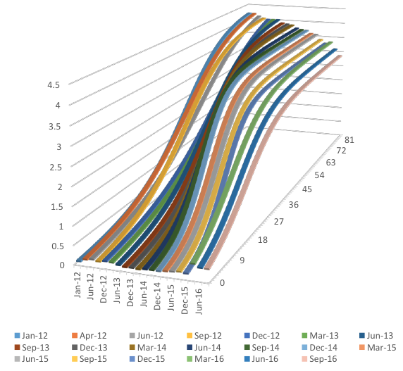
Figure 2 shows the fitted curves for all projection between January 2012 and September 2016. The changes over time in the expected timing and speed of interest rate increases are noticeable. The curves indicate that in the first part of the sample, FOMC members did not anticipate any significant increase in interest rates for a number of months, and that the increases would be gradual once they began. By mid-2014, FOMC members expected an interest rate increase much sooner, and interest rates were expected to continue to increase rapidly thereafter. By June 2016, interest rate increases were expected almost immediately.
Figure 2. Estimated interest rate curves
Changes in the levels of the projected interest rates are also evident. Projected interest rates are low at the short-end throughout all of the sample period, until immediately after the interest rate increase in December 2015. Similarly, the decline in the long-run interest rate projection is evident throughout the sample period, and particularly so at the end of the sample.
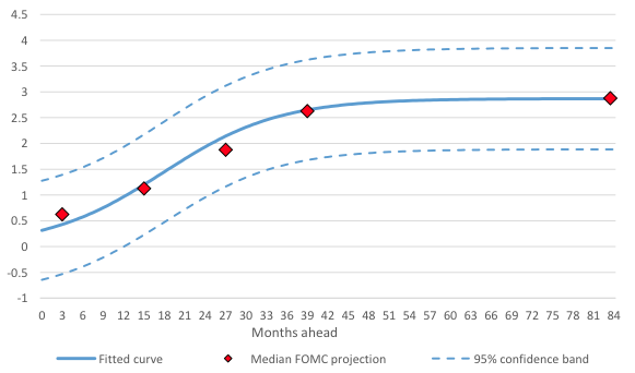
Furthermore, the non-linear regression models we use to interpolate between the dots fit the data well. Figure 3 shows the fitted curve for September 2016. For each of the four maturities for which we have data, we also indicate the median expectations together with a 95% confidence band for the fitted value. Importantly, the fitted curve is very close to the median value (as we discuss in our paper in detail).
Figure 3. Fitted curve, 95% confidence band, and median projection, September 2015
The role of macroeconomic news
We next explore what factors drive the FOMC’s interest rate expectations. To do so, we use the fitted curves to compute a measure of the projected interest rate for a fixed horizon of one, two, and three years ahead. Next we study how the projected interest rates evolve as economic conditions change. We focus on how the interest rate projections respond to PCE inflation, PCE inflation excluding food and energy (PCE core inflation), growth in non-farm payrolls and the unemployment rate, since much market commentary focuses on these variables.
Our statistical analysis shows that at a projection horizon of 12 months, a 1% increase in core inflation raises the projected interest rate by 45 basis points (bps) and a 1% decline in the unemployment rate raises the projected interest rate by 26 bps. Changes in non-farm payrolls and headline inflation do not seem to matter.
Interestingly, for horizons of 24 and 36 months, neither headline nor core inflation impact on the projected interest rate. In contrast, a 1% decline in the unemployment rate raises the interest rate projected in 24 months by 42 bps and that projected in 36 months by 38 bps. Furthermore, 1% growth in non-farm payrolls raises them by 140 bps and 157 bps. These findings suggest that in setting interest rates the FOMC is more concerned about the state of the labour markets, both because of the Fed’s dual objective and because the state of the labour market influences inflation.
Conclusions
We use a simple technique to construct constant-maturity projections of future interest rates by interpolating between the dot plots produced by the FOMC. We then study what macroeconomic factors explain the movements in the projected yields. Our econometric work shows that they responded more strongly to labour market conditions than to inflation. Of course, during this sample, inflation generally declined, and was below the FOMC’s stated target of 2%. Since inflation was under control, it is perhaps not surprising that the FOMC was responding more strongly to labour market conditions.
References
Bernanke, B (2016), “The Fed’s shifting perspective on the economy and its implications for monetary policy”, Brookings blog, 8 August.
Berriel, T, C Carvalho, and O Machado (2015), “Lift-Off Uncertainty: What Can We Infer from the FOMC’s Summary of Economic Projections?”, Society for Economic Dynamics, 2015 Meeting Papers, No. 903, February.
Feroli, M, D Greenlaw, P Hooper, F S Mishkin, and A Sufi (2016), “Language after Liftoff: Fed Communication Away from the Zero Lower Bound”, report prepared for the 2016 US Monetary Policy Forum, 26 February.
Gerlach, S, and R Stuart (2016), “Joining the Dots: The FOMC and the future path of policy rates”, CEPR Discussion Paper No 11618.
Kahn, G A, and A Palmer (2016), “Monetary Policy at the Zero Lower Bound: Revelations from the FOMC’s Summery of Economic Projections”, Federal Reserve Bank of Kansas City, Economic Review, First Quarter.


