Is the US looking like Italy? Projections on COVID-19 death rates
This column uses the actual number of COVID-19-related deaths to calculate projections for the US based on other countries’ experiences.
Search the site

This column uses the actual number of COVID-19-related deaths to calculate projections for the US based on other countries’ experiences.
Editors' note: This post originally appeared April 13 on the St. Louis Fed’s On the Economy blog: Is the U.S. Looking Like Italy? Projections on COVID-19 Death Rates.
We pose a counterfactual question in this column: What if the COVID-19 death rates in the US followed the pattern in countries such as Italy, South Korea or Spain?
We used the actual number of COVID-19 deaths in other countries to calculate projections for the US (For daily updates on the projections, visit the St. Louis Fed’s Research webpage: Daily Data and Projections on COVID-19 Death Rates.)
For example, consider the following calculation involving Italy: starting with a threshold death rate (say, 0.05 deaths per million people in the population), we know what the death rate in Italy was each day after that threshold was reached. We then applied the Italian death rate to the US after the corresponding number of days since the US reached the same threshold for its population.1 This is illustrated in Figure 1.

The right axis gives the total number of deaths, the left axis gives the death rates per 1 million people in the population, and the x-axis tracks the number of days since the death rate for each country was 0.05 per 1 million people.
The US had 16 deaths by March 7—a death rate of 0.05 per 1 million people. It took 28 days for South Korea to go from a death rate of 0.05 per million people to a rate of 2 per 1 million people. If the US had followed South Korea's pattern of death rates, US deaths would have reached a rate of 2 per 1 million people on April 4. In reality, it reached that death rate on March 24, or 17 days later. The US and South Korean paths have been diverging for several weeks now.
Is the US path beginning to look more like the Italian path?
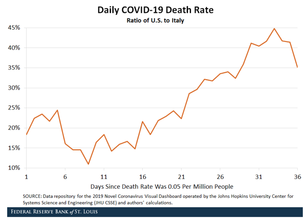
Furthermore, Italy’s path is showing signs of tapering off: The daily deaths in Italy have plateaued for about two weeks around 12 deaths per 1 million people, while U.S. deaths have continued to increase. Figure 2 illustrates the ratio of daily deaths per 1 million people in the U.S. to the corresponding number in Italy; the ratio is a “smoothed” line that best fits the data.

On day 10—that is, 10 days after reaching the threshold death rate of 0.05 per 1 million people—the daily death rate in the US was less than 20% of the rate in Italy. On day 35, it was more than 40%.
While the US exceeded Italy in the total number of deaths as of April 11, the number of daily deaths adjusted for population is less in the US than in Italy. However, the general trend over the last four weeks suggests that the US seems to be on its way to catching up with Italy on that metric.
1 As of March 21, the U.S. had 327 deaths related to COVID-19. The U.S. population is 327 million, so its death rate on that day was 1 per 1 million people. The population of Italy is 60 million. As of March 2, Italy had 60 deaths related to COVID-19, so its death rate on that day was 1 per 1 million people.
6,299 Reads