How many people are poor, and how fast are they leaving poverty? The World Bank (Chen and Ravallion 2001, 2010) says that a quarter of the people in the developing world lived on an income of less than $1.25 a day (the threshold of absolute poverty defined by the lowest poverty lines in developing countries), down from about 40% in 1992. However, another body of the development literature (to which the authors of this column belong) argues that poverty is much lower (under 5% in 2010), and has declined much faster (Bhalla 2002; Sala-i-Martin 2002, 2004, 2006; Pinkovskiy and Sala-i-Martin 2009 and Sala-i-Martin and Pinkovskiy 2010).
Both literatures use inequality data from household income and consumption surveys to compute income distributions and poverty rates in developing countries, and to conjecture at the shape of the distribution of income for countries and years with no available data. However, from this point, the literature bifurcates. The World Bank anchors estimated country distributions of income to mean income from the surveys they use to compute inequality, whereas Bhalla, Sala-i-Martin and Pinkovskiy rescale the mean of each country distribution to be equal to the GDP per capita for that country in the national accounts. The choice of the mean of the distribution matters empirically because it turns out that, for many developing countries, the survey means are much smaller than the national accounts' GDP per capita and grow much more slowly; for example, India grows by over 100% between 1994 and 2010 in the national accounts, but only 38% in the surveys. Such differences dwarf any difference in reasonable assumptions about the evolution of inequality in the developing world.
Nobody really knows why the survey means are different from the estimates of GDP per capita (Deaton 2005). The rationale for using the national account's GDP per capita is that the distribution of income should be consistent with all the macroeconomic studies used to evaluate the performance of countries. Moreover, there are good reasons to believe that there is a great deal of misreporting in household surveys. Survey-based consumption estimates are sensitive to the length of recall periods and likely understate true consumption, and they also exclude important categories of consumption, such as the flow of housing consumption enjoyed by homeowners. Economists using GDP as the anchor implicitly assume that the missing income occurs proportionally across the entire income distribution.
Researchers who like to use the survey mean, on the other hand, argue that it is possible that much of the income missing from the surveys goes to the nonpoor (Chen and Ravallion 2010). Hence, even though GDP is a good measure of overall income, when it comes to estimating poverty the survey distribution of income is accurate for the lower tail and should not be rescaled to match an externally obtained mean. Moreover, national accounts tend to be computed by national statistical agencies, often using outdated assumptions about the structure of the economy (Deaton 2005). So far, however, the discussion of whether national accounts or survey means are a superior measure of the means of the income distributions of developing countries has been largely qualitative, with no way to use the data to discriminate between the two measures.
Shedding light on the debate
In new research we suggest such a data-driven way to assess the relative quality of national accounts and survey means by using a third, independently collected data source on economic activity. This data is satellite-recorded luminosity at night as measured by weather satellites of the National Oceanic and Atmospheric Administration (NOAA).1 The advantage of this data is that measurement error in night-time lights is unrelated to measurement errors in national accounts or surveys, making lights an independent measurement of true income, against which we can assess the other measurements.
To disentangle whether national accounts or survey means are closer to true income, we postulate a factor model in which national accounts GDP per capita, survey means and night-time lights are linear functions of unobserved, true income (and, potentially, other covariates), perturbed by random disturbances. The identifying assumption that we make to compute the factor weights is that the measurement error in lights is uncorrelated either with measurement error in GDP or with measurement error in surveys. In general, a positive correlation between measured income (national accounts or survey means) and night-time lights could be due to two factors:
- They are both correlated with true income; or
- Their measurement errors are strongly correlated with each other.
However, the latter possibility is implausible because the generating process of night-time lights data (impersonal observation by satellites) is to a very large degree independent of the generating process either of national accounts or of survey means (country-based surveys of potentially unwilling respondents by statistical teams).2 Therefore, the correlation between night-time lights and measured income is directly related to the correlation between the given income measurement and the true income it is trying to measure.
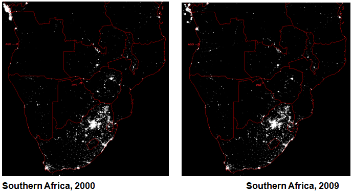
A simple way to illustrate our point is to look at two poor regions for which national accounts and survey means give completely different growth estimates, i.e. Angola and India. Figure I presents a picture of night-time lights over southern Africa in 2000 and in 2009. We see that Angola, which experienced a 5% decline in survey per capita income, but a doubling of GDP per capita, has many more lights in 2009 than it did in 2000. In contrast, Zimbabwe has fewer lights, because of its economic collapse under the disastrous hyperinflationary policies of Robert Mugabe.
Figure 1. Southern Africa in 2000 and 2009
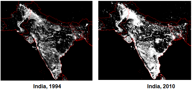
Figure 2 gives a view of India between 1994 and 2010. Its survey income grew by 29% over this time period, but its GDP per capita more than doubled during this time. We see that lights in India increase dramatically both in their intensity over the major cities as well as in their extent over previously dark areas of the country.
Figure 2. India in 1994 and 2010
The increase in lights in India and in Angola is much closer to what the national accounts suggest than what the survey means do, and it is very unlikely that this additional economic activity benefits exclusively the rich because of the spatial extent of the new lights. While these figures are only suggestive (the lights we observe are aggregate rather than per capita lights), they already provide a hint that economic growth in the developing world may have been more extensive than surveys show.3
We find that national accounts do a better job. In our baseline specification of the factor model, the weight that we wish to place on survey means is 18% of the weight that we wish to place on national accounts GDP, and statistically insignificantly different from zero. In principle, it could be the case that the factor model we postulated above varies across countries and years, or that our exclusion restriction fails because industrial composition in a country is correlated both with GDP and light intensity. However, we can account for all these possibilities by adding control variables to our factor model, or estimating it separately across regions and time periods, and when we do so, the weight on the survey means, if anything, tends to be even less than 18%.
New worldwide poverty estimates
Finally, we use the new optimal measure of true income to calculate the evolution of poverty at the worldwide level as well as at the regional level. Given that our optimal measure gives a small weight to survey means, our optimal estimates of poverty rates tend to be closer to those reported in the research that uses GDP as the anchor. Under our procedure, developing world poverty declines from 11.8% in 1992 to 6.1% in 2005 and 4.5% in 2010, much lower than the path constructed by giving a weight of 1 to the surveys, which entails poverty falling from 42% to 20.5% between 1992 and 2010. We run a battery of robustness checks on our findings; under the ones most favourable to replicating the survey-based results, the largest that we find developing world poverty to be in 2010 is 12%.
And this is the main conclusion of this paper. When we let the data speak on the national accounts-survey means debate, the national accounts-based approach predicts poverty rates better.
Note: Any views expressed in this paper are the authors' and do not necessarily reflect those of the Federal Reserve Bank of New York or of the Federal Reserve System. All errors are our own.
References
Bhalla, Surjit S (2002), Imagine there's no country: Poverty, inequality, and growth in the era of globalization, Washington, D.C.: Penguin.
Chen, Shaohua and Martin Ravallion (2001), "How Did the World's Poorest Fare in the 1990s?", Review of Income and Wealth 47, no. 3: 283-300.
Chen, Shaohua, and Martin Ravallion (2010), "The Developing World Is Poorer Than We Thought, but No Less Successful in the Fight against Poverty", Quarterly Journal of Economics 125, no. 4: 1577-1625.
Chen, Xi, and William D Nordhaus (2010), "The Value of Luminosity Data as a Proxy for Economic Statistics", NBER Working Papers: 16317.
Deaton, Angus (2005), "Measuring Poverty in a Growing World (or Measuring Growth in a Poor World)", Review of Economics and Statistics 87, no. 1: 1-19.
Elvidge, Christopher D and Kimberly E. Baugh, Eric A Kihn, Herbert W. Kroehl, Ethan R. Davis (1997), "Mapping City Lights With Nighttime Data from the DMSP Operational Linescan System", Photogrammetric Engineering & Remote Sensing 63, no. 6: 727-734.
Elvidge, Christopher D, Kimberly E Baugh, John B. Dietz, Theodore Bland, Paul C Sutton and Herbert W Kroehl (1999), "Radiance Calibration of DMSP-OLS Low-Light Imaging Data of Human Settlements", Remote Sensing of Environment, 68(1):77-88.
Elvidge, Christopher D, Kimberly E Baugh, Sharolyn. J Anderson, Paul. C Sutton, and Tilottama Ghosh (2012), "The Night Light Development Index (NLDI): A Spatially Explicit Measure of Human Development from Satellite Data", Social Geography 7, 23-35.
Henderson, J Vernon, Adam Storeygard, and David N Weil (2009), "Measuring Economic Growth from Outer Space", NBER Working Paper 15199
Pinkovskiy, Maxim L and Xavier Sala-i-Martin (2009), "Parametric Estimations of the World Distribution of Income", NBER Working Paper 15433.
Sala-i-Martin, Xavier (2002a), "The Disturbing 'Rise' of Global Income Inequality." NBER Working Paper #8904.
Sala-i-Martin, Xavier (2002b), "The World Distribution of Income (estimated from Individual Country Distributions)." NBER Working Paper 8933.
Sala-i-Martin, Xavier (2006), "The World Distribution of Income: Falling Poverty and ... Convergence, Period", Quarterly Journal of Economics 121, no. 2: 351-397.
Sala-i-Martin, Xavier and Maxim L Pinkovskiy (2010), "African Poverty is Falling...Much Faster Than You Think!", NBER Working Paper 15775.
1 The satellite-recorded luminosity data reports the light intensity in every geographic location in the world at a resolution of approximately 1 square kilometer as measured by each satellite in operation in each year from 1992 to 2010. For our analysis, we aggregate the spatial luminosity data and divide the aggregate by country population to form a panel dataset of light intensity per capita for each country and year from 1992 to 2010. Satellite-recorded luminosity data was first used as a proxy for income in Elvidge et al. (1997, 1999, 2012), and first used in economics by Henderson, Storeygard and Weil (2008) and Chen and Nordhaus (2010).
2 Much of the measurement error in national accounts and survey means comes from nonresponse, outdated input-output tables and price index choice, while much of the error in nighttime lights comes from weather disturbances, changes in satellite sensitivity to light, and differences in light intensity between sectors of the economy. Controlling for industrial composition does not affect our estimates of optimal weights or poverty.
3 A potential problem in interpreting these pictures may be that satellites change their sensitivity to light over time and are eventually replaced with new ones. Since we observe Angola growing and Zimbabwe shrinking over the same period of time and measured with the same satellites, uniform differences in brightness between satellites do not dominate the observed variation in lights. This is not a problem for our analytical results because allowing the optimal weights to vary by year does not change our estimates.


